Blurring Boundaries
UX across ecosystems.
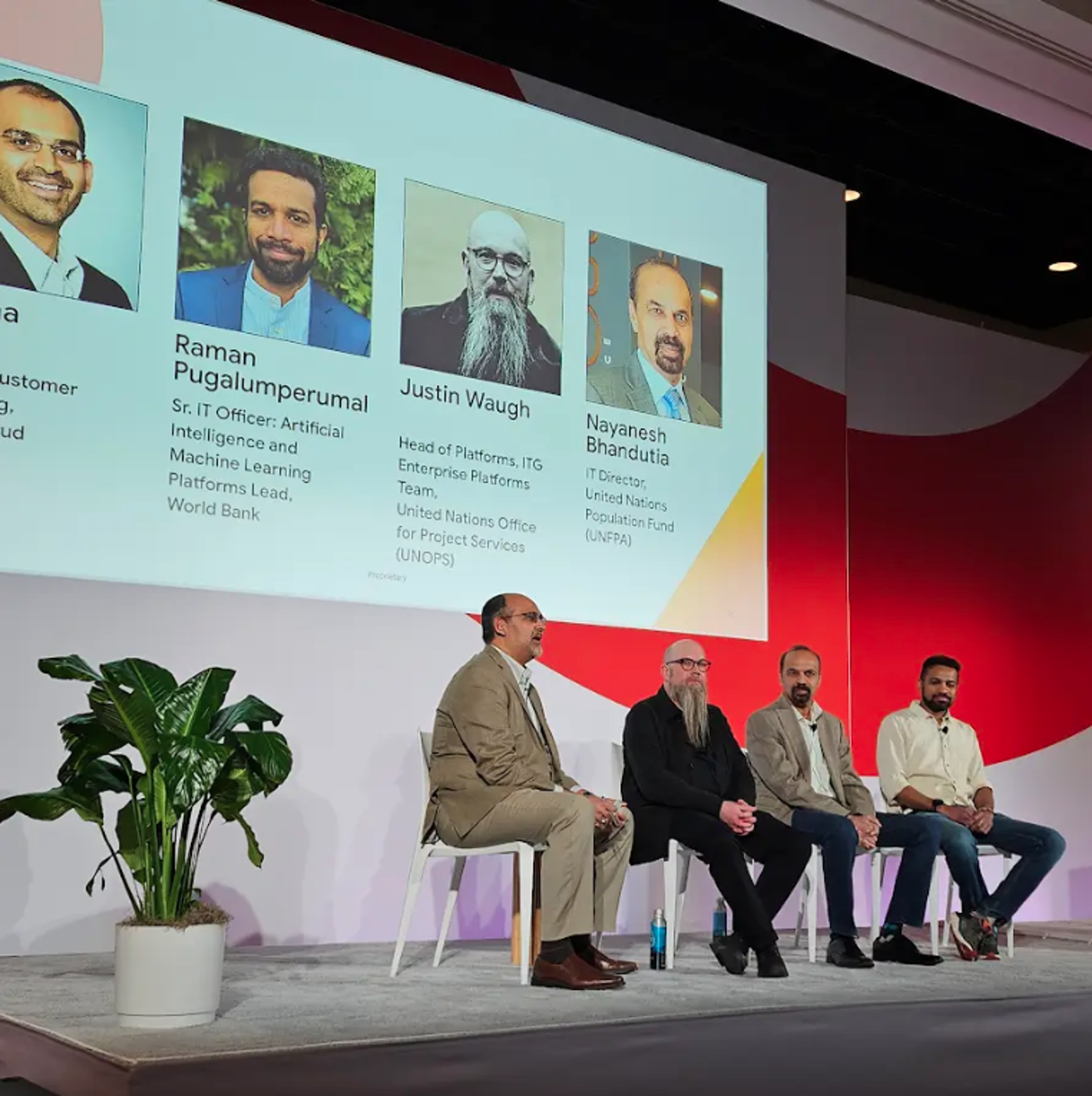
Earlier this year, I had the chance to speak at Google Next '24 in Vegas. The topic? "Breaking Silos Worldwide."

While prepping, I started thinking about how we've been tackling this within UNOPS (United Nations Office for Project Services ) – especially from a UX perspective. It's a common challenge: many organisations end up with a bunch of custom-built systems and various vendor solutions (SaaS or PaaS). This ends up creating a disjointed experience for users – they're constantly jolted as they switch between different applications.
So, what's the solution?
We could just tell users to deal with it, right? After all, it's not like we have total control over everything. And honestly, that's probably the most common approach. But I think there's a better way.
A while back, I decided to fully embrace our main vendor ecosystem – for us, that's Google Workspace. It's the productivity suite for everyone at UNOPS, although we do use other vendor ecosystems like Atlassian and Salesforce.
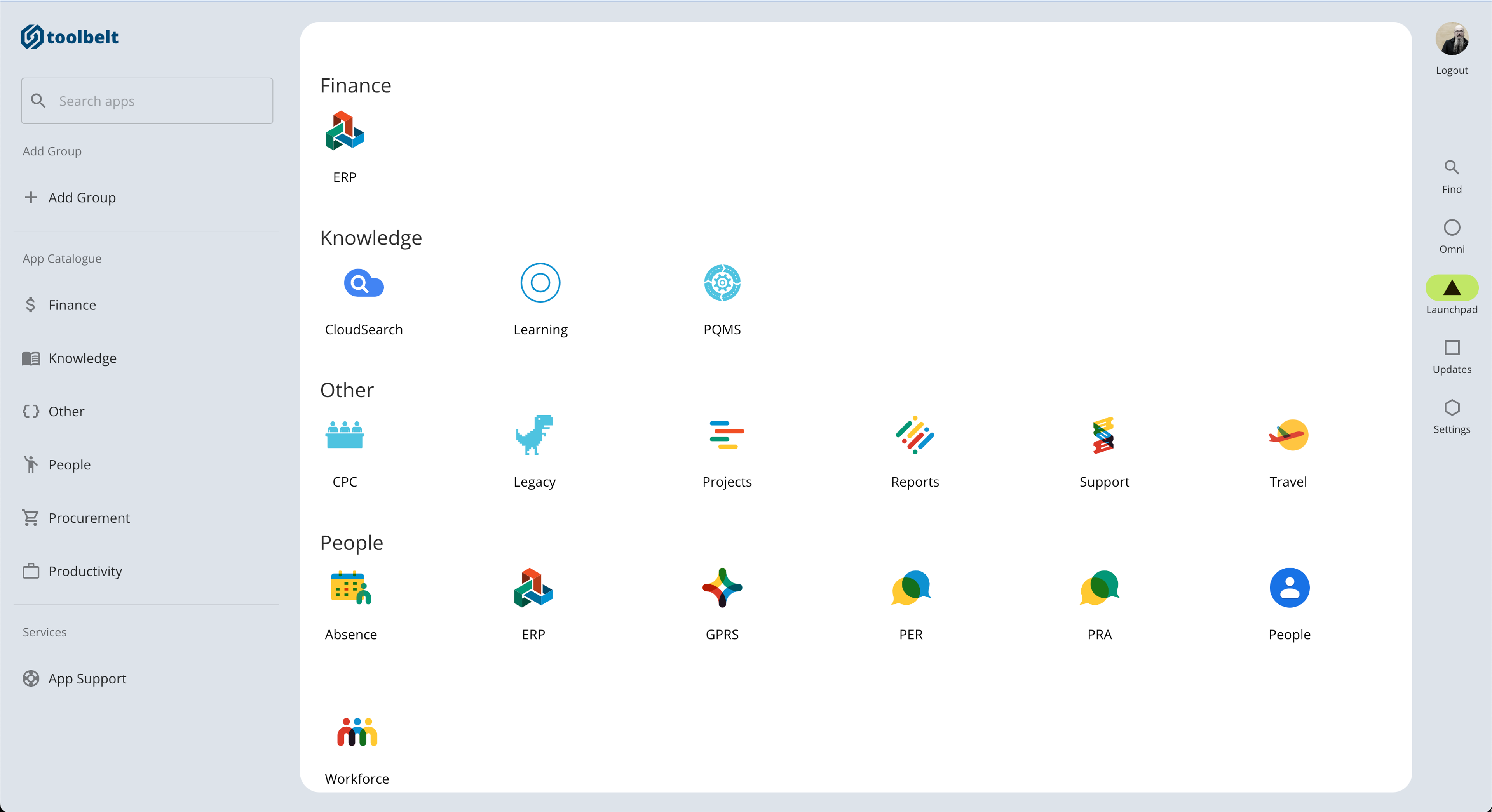
For me, this "leaning in" meant finding ways to blur the lines between our in-house apps and Google Workspace. This started with adopting Google's toolbar design in our intranet:

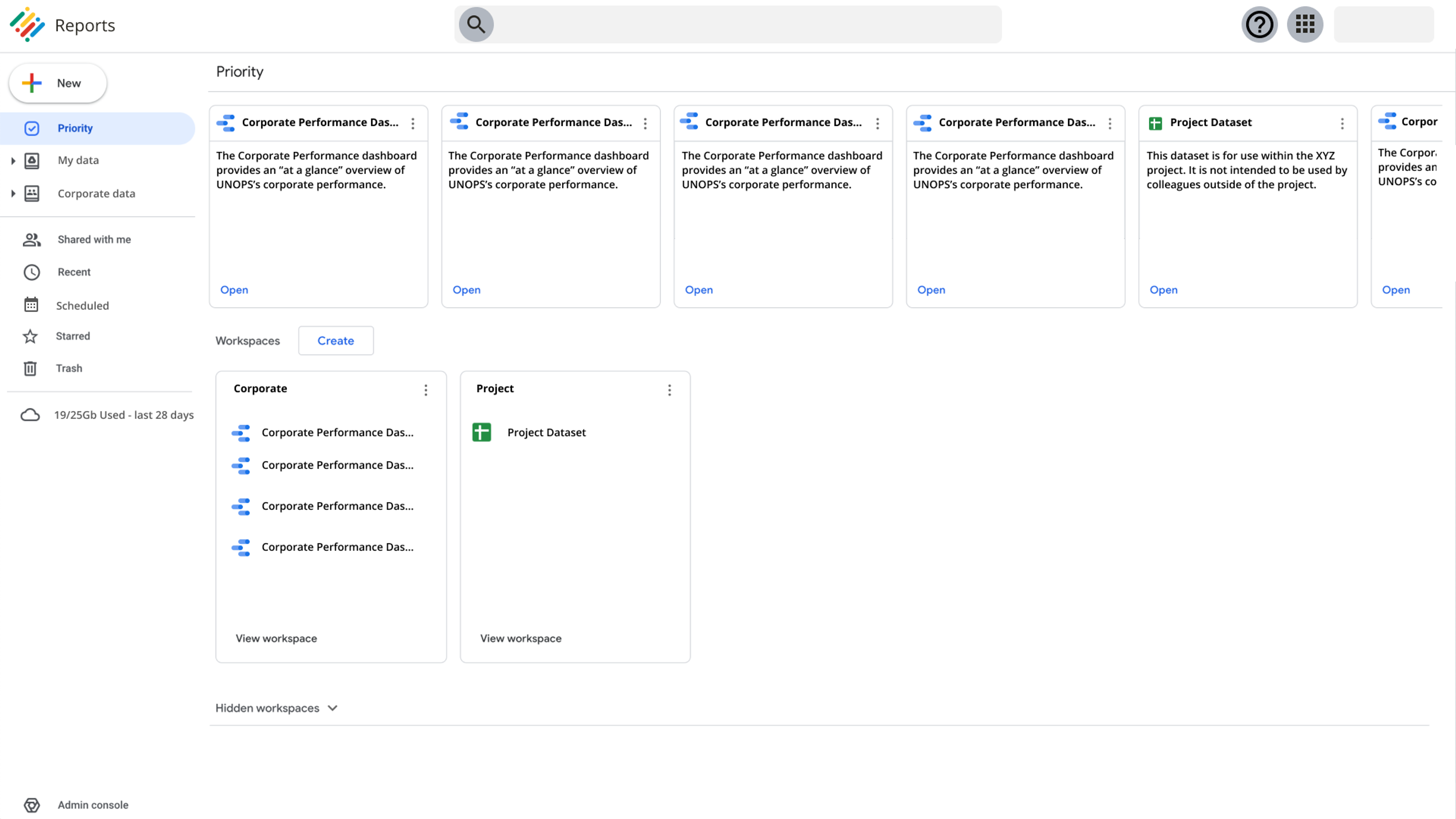
We continued with other designs that aimed to match the Google Workspace feel:

I know, I know – it's easy to say these designs are just copying Google. But remember Jakob's Law:
Users spend most of their time on other sites. This means that users prefer your site to work the same way as all the other sites they already know.
If your users are already familiar with something, why make them struggle with something different? It might not be the most groundbreaking approach, but it works. There are times when I deviate a bit from this, often by using Material Design. This is mainly because I'm aiming for some consistency, and let's be real – I don't have Google's research budget!

Okay, now back to that "multiple ecosystems" thing...
Obviously, I'm not suggesting we force Material Design into Atlassian or Salesforce. When we're working directly within those ecosystems, we of course stick to their design language.
But when we're not working within a specific ecosystem, I think about "proximity." Certain groups of people use certain sets of applications, and some tasks naturally flow together. When those are more aligned with one ecosystem, it makes sense to adopt that design language for related products and tools.
In short, to create a more cohesive user experience within a multi-vendor environment, we've chosen to prioritise familiarity and consistency by aligning our in-house designs with our main vendor ecosystem, Google Workspace. This doesn't mean we blindly copy everything, but rather we strategically adopt elements to reduce user friction and create a sense of continuity across platforms.


